Flatiron School project · Constellation Brands

Ambassador

Designed a mobile app to make it easier for employees to discover, track, and share information about 100+ brands.

Role
UX/UI Designer
Team
UX Manager, UX Designers
Timeline
5 weeks
Platform
Mobile
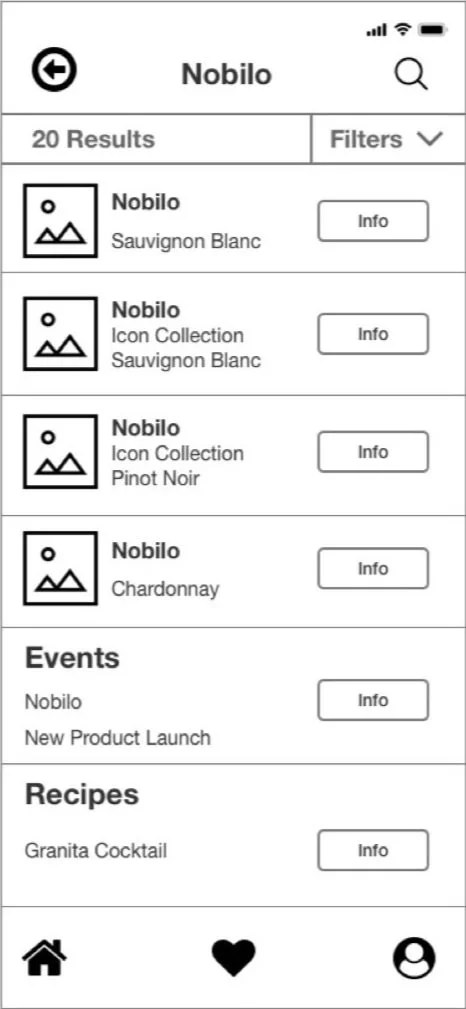
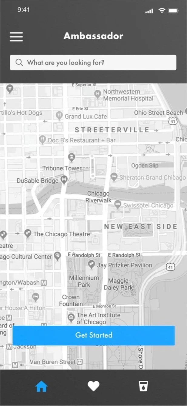
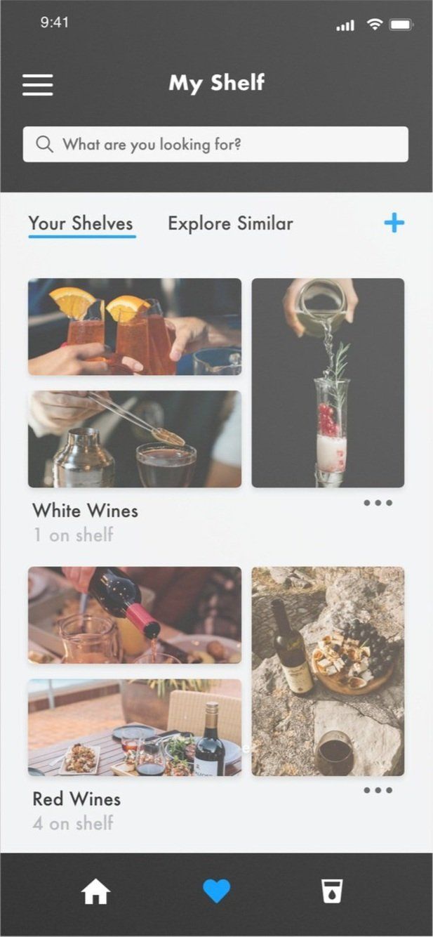
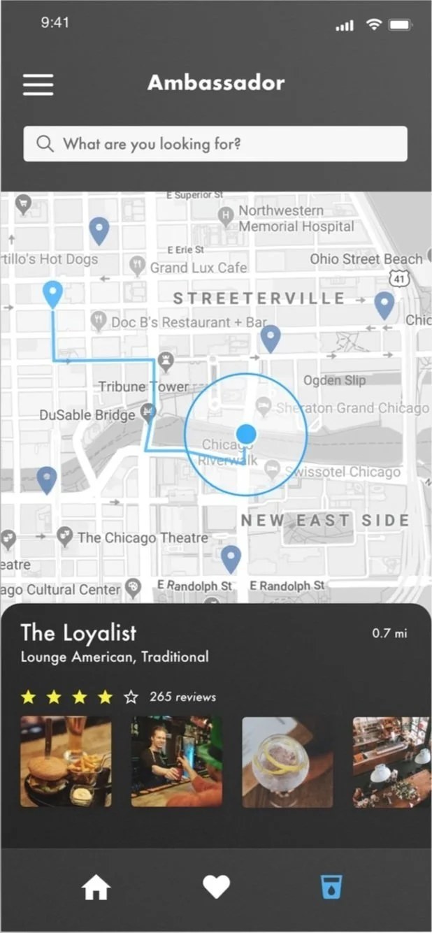
Ambassador home screen with search and a map of nearby accountsAmbassador search results for Nobilo: products, collections, recipes and eventsMy Shelf screen with saved white and red wines

Problem statement

Employees loved the brands but couldn’t find product information in the existing CRM: search meant digging through vendor and store records, and stipend tracking was confusing.

Outcomes

  1. A focused MVP of Search & Filter, Event Shaker and My Shelf, refined through user testing

  2. Product-first search instead of store-by-store hunting

  3. A research-backed backlog, including a stipend tracker for later

My role

Research

  • Stakeholder and SME interviews
  • Employee interviews across departments
  • Competitive analysis of social and beverage apps

Synthesis

  • Affinity and journey mapping
  • Rose, Thorn, Bud prioritization
  • Design principles to guide decisions

Design & Testing

  • Wireframed four feature directions
  • Tested wireframes with users
  • Converged on hi-fi MVP mockups

User research

What employees told us

Interviews with employees across Constellation Brands departments surfaced four consistent pain points with the existing Compass CRM.

Low awarenessMany employees didn’t know Ambassador existed
Knowledge gapsMost reps specialized in only one of beer, wine or spirits
Cumbersome searchFinding a product meant navigating vendor or store records
Stipend confusionHard to track the annual allowance, often leading to single large purchases
“The more we learn about the total company portfolio, the more we’re able to raise a glass and raise our sales.”
Constellation Brands employee

Synthesis

Three themes, four feature directions

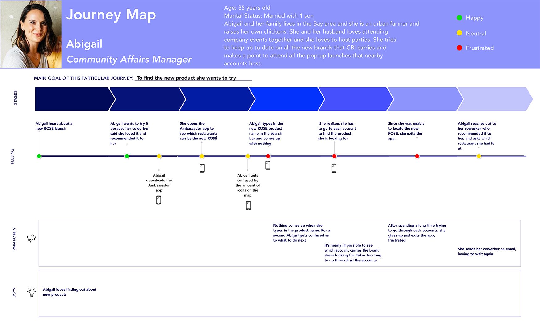
Affinity mapping, journey mapping and Rose, Thorn, Bud turned interviews into three themes that set feature priorities. Abigail’s journey, a Community Affairs Manager discovering a new product, showed where the existing app broke down.

Brand educationWine pairings, cocktail recipes and ratings history.
Brand loyaltyPurchase tracking and easy repurchasing of favorites.
Search limitationsBetter portfolio filtering and content-specific search.
Journey map for Abigail, a community affairs manager

Design decisions

Key design decisions

Decision 01

Search around products, not stores

What I did. Designed structured search and filtering across the full portfolio by category and content type, so employees could go straight to a product.

Why it mattered. Finding: employees had to dig through vendor or store records. As one put it, “I have to search, and I have to click on each store to see if the store carries it.”
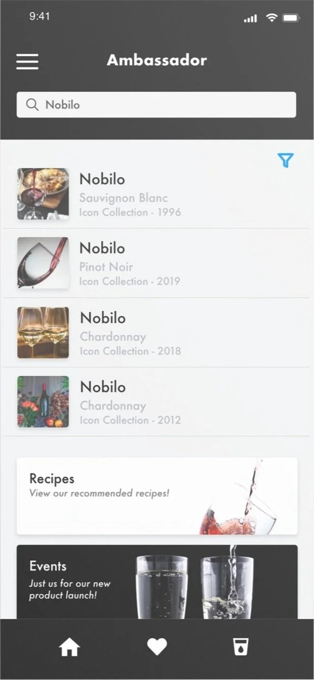
Ambassador search results for Nobilo: products, collections, recipes and events
Final search results: a product, its collections, recipes and events, filterable by type.
Decision 02

Make brand loyalty personal

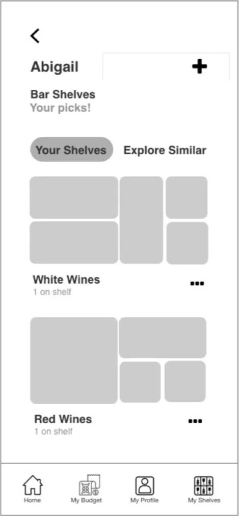
What I did. Designed My Shelf, where employees collect favorite products and share them with their networks.

Why it mattered. Finding: “There should be an easy way to create a record of which wine I like, so I can easily share it with friends.”

My Shelf screen with saved white and red wines
My Shelf: favorite wines organized into shelves, ready to share.
Decision 03

Make nearby accounts easy to discover

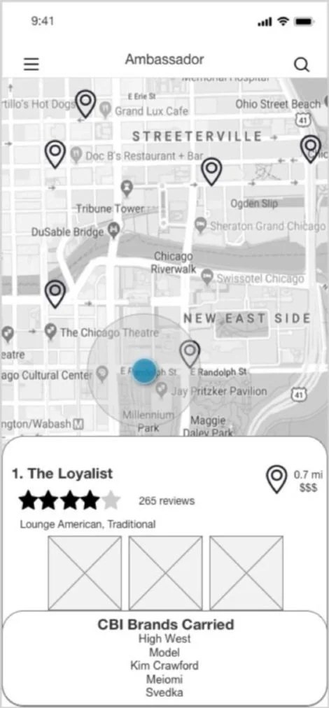
What I did. Designed Event Shaker: shake the phone to randomize and locate nearby accounts on a map.

Why it mattered. Stakeholder and SME interviews pointed to a more social platform where employees act as brand ambassadors, and “Sociable” became one of our four design principles.

Event Shaker result: a nearby account with rating, reviews and photos
Event Shaker: a nearby account with reviews and photos, found with a shake.
Decision 04

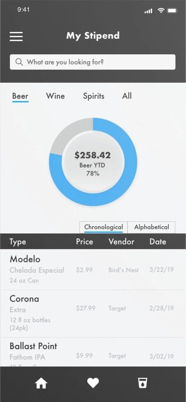
Park the Allowance Tracker

What I did. The stipend finding led to an Allowance Tracker. It tested with interest, and I designed a high-fidelity version, but the team excluded it from the MVP because it drifted from our core problem statement.

Why it mattered. In hindsight, my view is that we sidelined it too quickly; a smaller exploration of how employees manage their allowance could have been worth it.

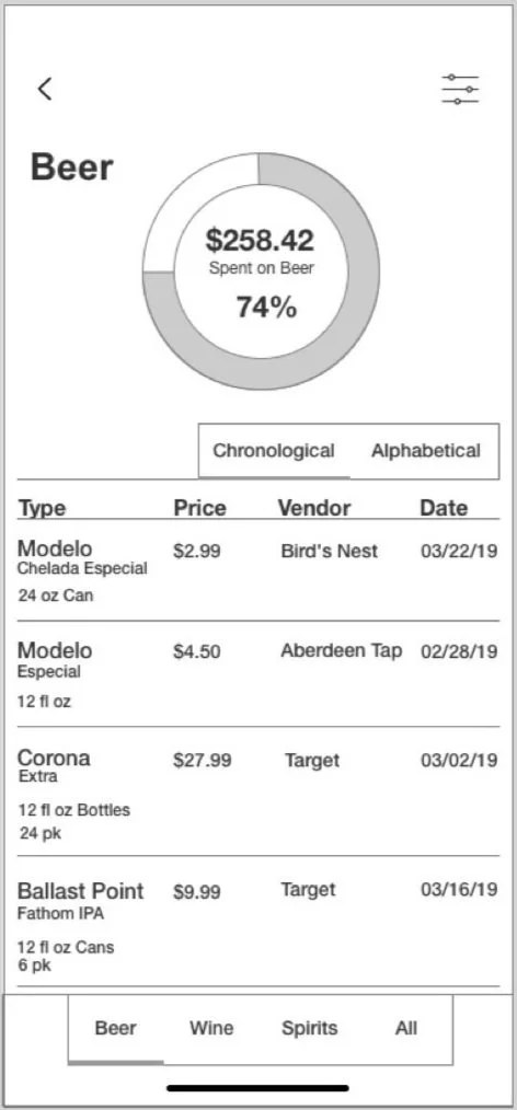
Stipend tracker showing the remaining annual product allowance
Allowance Tracker, designed but left out of the MVP: spend by category against the annual allowance.

Reflection

Solve the right problem first

Ambassador reminded me not to confuse an interesting feature with the most important problem to solve. Some of our early ideas tested well, but the research kept bringing us back to a more fundamental need: helping employees understand and navigate a huge portfolio of brands. I’d still explore some of the ideas we set aside, but only after validating that they support that core need.

Flatiron School project · Chicago Public LibrarySparkNext case study